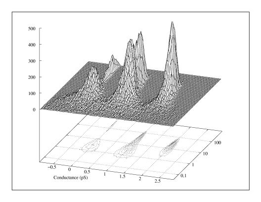
This plot shows the frequency with which a simulated ion channel signal had segments with different conductances and durations. It is largely self-explanatory. It is not yet an aim of the Adage project to implement all the processes required to generate such a plot. Adage would be used as the rendering engine for a program that can generate the contours from multidimensional data. Nevertheless, this could become part of the project.
The contours are plotted in an inappropriate dotted line because Gnuplot is incapable of producing anything better. A waterfall plot might have been preferred, but Gnuplot is also inadequate in this regard. A waterfall plot is like a mesh plot but with connecting lines in only one direction. Instead of looking like a deformed grid, it is like a deformed striped carpet.
