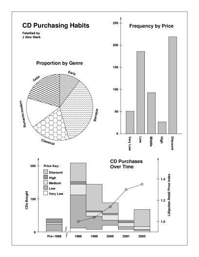
This example is composed of three illustrations of drawing types used to convey business and economic information. The pie chart is standard. Note that under our definition the graph of frequency over time is a plot whereas the graph of frequency by price is a chart. The first incorporates a histogram. This has two axes, one being the interval scale time. The second is a bar chart which represents categorical data and has distinct bars.
Even though one can draw formal distinctions between these drawings, they are typical of illustrations designed to convey a limited amount of information with clarity and impact.
Although fictitious, the author's (JAS's) CD buying habits are reflected somewhat in this data. Naxos continues to expand its range of high-quality classical music at attractive prices, in contrast to most other labels. Most CDs normally at premium prices were only affordable at club (`discount') rates. This is not intended to be a product endorsement, but rather a criticism of other labels.
